I got the idea of this post after answering a question from Stackoverflow. When creating an Android application, it is almost mandatory to have an ActionBar in order to provide a good navigation experience to the user.
What is an ActionBar ?
An ActionBar is specific to each Activity of your application. This is ar the top of the screen, where the title of your page and the menu are shown :

You can switch between fragments as many time as you want, this ActionBar will remain the same as long as you are in the same activity. Of course, you can configure it at any time to change its menu, icon, text, color, or even (and above all) the actions performed regarding the button clicked by the user.
How do I add an ActionBar to my mobile app ?
Nothing’s easier ! In fact, it’s already added 🙂 We’ll only see how to set up your own ActionBar step by step.
If this is not already the case, download and install the Nuget package Xamarin Android Support Design. This makes it easier to get your mobile apps compatible with older Android versions. Then copy the code below into your MainActivity.cs and MainActivity.axml files. I don’t copy the content of Strings.xml file here. If you are interested, everything is available on my Github !
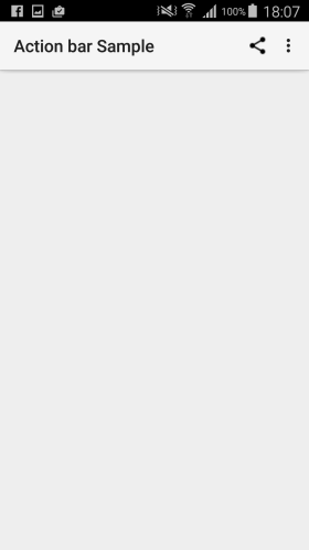
There is nothing special in this code : it simply configures the Activity’s SupportActionBar’s Title. That’s all ! Is not that easy ?
Before compiling to see your work, you must specify that your Activity have to use a theme corresponding to AppCompat (your activity is an AppCompatActivity). Add this information in your manifest, in the Application tag (android:theme = ….) :
You can now compile and deploy to your phone :

How do I add a menu to the top right of my ActionBar ?
The main purpose of an ActionBar is to make the navigation of your user easy. Telling your user in what page he is, thanks to the Title, is nice ! But allowing him to do common actions with only 1 click is really much better !! For instance, you could allow your user to share content on social networks in only 1 click. Interesting isn’t it ?!
Let’s start by creating a “menu” folder in the “Resources” folder of your Android project :

Then, create a file called top_menus.xml in the folder previously added. Copy into this file the code below. This code declares two items for your menus. There will be 1 icon to share content on social networks, and 1 “More” icon (in 3-points form). The “More” icon will display an additional menu item “more option …”.
Now that the XML file of your menu is ready, you have to indicate to your activity that it must use it. This happens in the OnCreateOptionsMenu() method.
Then, you must indicate what actions the activity have to perform when the user clicks on one of your menu items. This happens in the OnOptionsItemSelected() method.
Add these two methods to your activity, and you’re done ! Do not forget the override keyword 🙂
With this code, when the user clicks on the share on social networks icon, he obtains the list of all applications with which he can share content. And when he clicks on the “more option …” entry, the title of the ActionBar is changed.


How to customize the color of my ActionBar ?
To customize the color of your ActionBar, use a theme. Let’s say we want a blue bar and white text / icons. We’ll expand the default theme and modify only the values we’re interested in. The default theme that we use is Theme.AppCompat.Light. As we want a white text color and icon, we will use the theme Theme.AppCompat.Light.DarkActionBar. Here is an overview taken from the developer doc to show you the difference between these two themes :

To extend and customize a theme, create a “styles.xml” file in the “values” directory of the “Resources” folder in your Android project. Copy the code below to set the colors of your choice. I don’t show the file colors.xml but if you are interested, everything is available on my Github !
Now, as before, we must specify in the manifest that our activity will use the ActionBarSampleTheme theme :
One last detail is missing. It is necessary to modify the custom icons of the menu in the top right. We had a black image for the share on social networks icon. Now we need a white image. Just add the image to the “drawable” folder in the “Resources” directory. Also, you should edit the top_menus.xml file if the name of your image is different from the first one.
Here is the result :

Why modify the theme rather than the ActionBar property ?
Previously, we saw how to customize the theme of the application to change the color of the ActionBar. However, it is possible to change the color of your ActionBar by using a method called SetBackgroundDrawable() associated with a ColorDrawable object. In my opinion, it is not a good practice to change the color of a graphic element in isolation.
Indeed, the good side with the style changes we’ve made, is that all the rest of the app will be impacted. This is very effective in keeping an identity and consistent brand image throughout the user experience. No oversight or error possible, colors are specified 1 time, and reused automatically throughout the application.
How do I add a sandwich menu to my ActionBar ?
Add an icon to open the menu
Now we know that the principle of an ActionBar is to facilitate the navigation of our user in order to improve his experience. But so far, we lack an important element to facilitate navigation ! A complete menu ! We will see how to add a “sandwich menu” icon to our ActionBar and how to display a menu on the left side of the screen.
To begin, we must add the code below in the OnCreate method of our Activity. You should also add a menu icon in your Resources/drawable folder named ic_menu_white_24dp.png.
Nothing else to do ! You can compile and admire the result … A superb menu icon appears to the left of your ActionBar :

To detect a user click on this button, you must complete the OnOptionsItemSelected() method of our activity :
Show a menu on the left side of the screen
This is good, we managed to display our sandwich menu icon allowing the user to access the full menu of the application. Now you need to know how to display this menu ! To do that, we will use a NavigationView integrated into a DrawerLayout. Don’t panic, we’ll see how to do this step by step. To start, we have to modify the AXML file of our activity :
Our LinearLayout has been replaced by a DrawerLayout. We added a NavigationView element, as if we were adding any view to a layout usually.
You may notice that the XML code above assigns a menu to the NavigationView visual element. As we did at the beginning of this tutorial for the right menu of our ActionBar, we need to create an XML file in the Resources/menu folder named left_menus.xml :
Do not forget to complete your Strings.xml file with the values of your menu items, and add pictures for the associated icons. If you do not want to think too much, all the sources of this tutorial are available on my Github 🙂
Now that we have made all the configurations to display our menu, we must complete the code of our Activity. Indeed, it is the Activity that will manage the display of our menu according to the user clicks. Here is the code to add to your MainActivity.cs file :
And here is the result, the menu is displayed from left to right either by clicking on the menu icon sandwich, or by sliding the finger of the left edge of the screen to the right :

Customize the menu display with user information
We’re almost at the end of this tutorial. It still lacks a small thing to our menu, don’t you think ? It lacks a “header”, that is to say a part that appears above the items of the menu and which allows to display what we wants. This header is very useful for enhancing the branding of your application and for displaying additional informations at the same time. Usually, those informations concern the connected user : the photo and the login for example. You know, we must not disturb the habits of our dear users ! 🙂 So let’s see how to display these informations.
The header of a NavigationView is in fact a classic view, created with an AXML file. Once the view is created, simply specify to our NavigationView that its header must be equal to this view.
First, let’s create our view. I want to display a background image, as well as the picture of the current user, his username, and his description. Add a mainActivity_navigationView_header.axml file to the Resources/layout folder of your project :
If you want to get the pictures I used, everything is available on my Github 🙂
Now that our view is created, we must set the texts and images according to the current user, and then specify to our NavigationView that its header must use this view. To do this, you must complete the MainActivity.cs file :
Here we are ! Nothing else to do, you can compile, deploy, and admire the result of your hard work :

Add notification badges to NavigationView items
Sometimes you want to notify your user that he has new messages to read, or more generally that an important thing requires his intention. For this, Android offers various tools such as push notifications. You can also notify the user directly via the menu, it’s very effective. When a user sees a red badge with a number inside, he immediately understands that a new thing requires his intention. We will see how to implement this with our menu.
To begin, complete your left_menus.xml file by adding the app:actionViewClass information to each of your menu item :
It is this TextView that will display your notification badges.
In your MainAcitivity.cs file, now add the code for styling and displaying (or not) your notification badge. For my part, I display a red square with rounded corners and a white number inside. For this example, the notification badge will be displayed or hidden each time you click on a menu item, dynamically. It is up to you to define your business logic, based on API queries and/or on a SQLite database, of course 🙂
Here is the contents of the left_menus_itemBadge.xml XML file, that you have to add to the Resources/drawable folder. This file is used to define the red square with rounded corners for our TextView’s background. I do not copy my color file, full sources are available on my Github 🙂
And the result :

I hope that these tips will help you in the development of your mobile apps ! Do not hesitate to comment, ask questions, propose other solutions, and especially to show your result 🙂